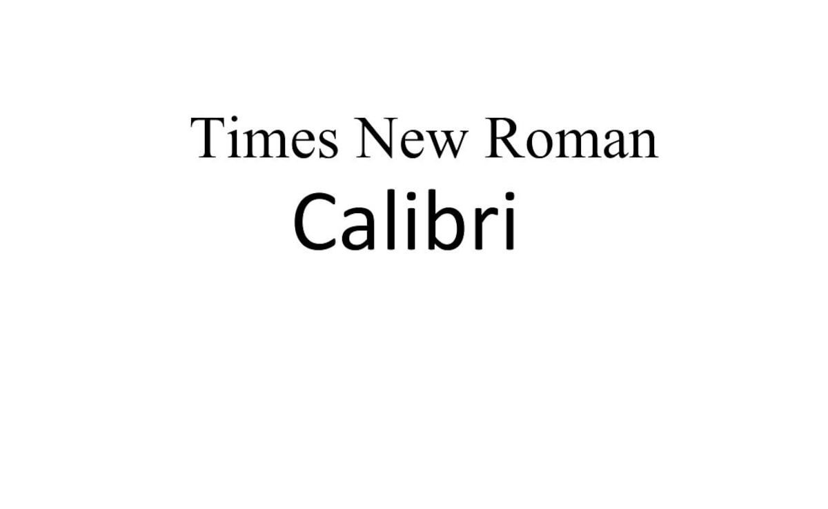
US Secretary of State Marco Rubio has directed all diplomats to return to using Times New Roman font for official communications, reversing a switch to "woke" Calibri made by the Biden administration in 2023, The New York Times reported.
What Led To This Change?
The decision was announced on December 9 to "restore decorum and professionalism" to the department's written work, as said by Rubio. "Typography shapes how official documents are perceived in terms of cohesion, professionalism and formality," Rubio said in a cable, seen by The Associated Press, sent to all US embassies and consulates abroad Tuesday.
The Biden administration had adopted Calibri, a sans-serif font, in January 2023, citing its accessibility for people with visual impairments.
However, Rubio's directive argues that Calibri is "informal" compared to serif typefaces like Times New Roman.

Notably, a sans-serif font is a style of typeface that lacks the small decorative lines at the ends of its letter strokes. In the absence of serifs, a clean and simple look is created.
But as per the announcement, the previous switch as a "wasteful" diversity, equity and inclusion initiative. "Switching to Calibri achieved nothing except the degradation of the department's correspondence."
"The switch was promised to mitigate accessibility issues for individuals with disabilities," the cable said, further adding that it did not achieve that goal, In fact, the 2023 change had cost the department $145,000, the letter noted without offering any evidence.
Social Media Reaction
In a post on X, one user said, "The funniest thing about marco rubio hating on calibri is that it goes to prove that rubio has not done one lick of work in years. Calibri has been the default font in Microsoft Word for 17 years. Why? bc Times New Roman was designed for print & it causes eye fatigue on screen."
"But it's more complicated than that. After all, Times New Roman used to be the default font on Microsoft Word. Now it's Calibri. And studies have proven inconclusive on whether Sans Serif or Serif typefaces are actually easier to read," another wrote.
Track Latest News Live on NDTV.com and get news updates from India and around the world


