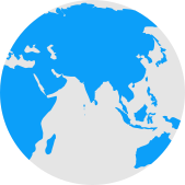
- The UN endorsed the Equal Earth map for more accurate continent sizes on September 4
- Equal Earth map shows Africa, South America, South Asia, and Oceania larger than Mercator
- Mercator map distorts size near poles, making Greenland appear almost as big as Africa
India looks smaller on a map than its actual size, and so does Africa. Greenland, meanwhile, looks almost as large as the entire African continent when, in reality, it's much smaller. For generations, this is the picture of the world that many of us have grown up with. It may soon look a little different the next time you open a map.
On September 4, the United Nations General Assembly backed a resolution encouraging countries, schools and technology companies to use maps that show the relative size of continents more accurately.
The map being promoted is called Equal Earth. It makes Africa, South America, South Asia and Oceania look considerably larger than they do on the familiar Mercator map.
This leaves travellers with an interesting question: will it impact their travel planning?
Equal Earth gives travellers a better sense of scale
Africa is about 14 times larger than Greenland, yet the Mercator projection makes their apparent sizes surprisingly similar. It also makes countries and regions closer to the poles appear much larger than they really are. Equal Earth corrects much of this distortion by showing the relative area of continents. For someone deciding where to travel, this can be useful.
If you are planning a trip to Africa, you'll see that it is not one compact holiday destination that can be covered in a couple of weeks. It is a vast continent, and the distance between popular destinations can be enormous. The new map makes that scale easier to appreciate before you start putting together an itinerary that combines several cities.
The same applies to South America and Australia. Looking at their true proportions can make you think twice before planning an over-ambitious multi-country trip.
Travel distances may feel different
One thing the new map will not do is change actual travel distances or flight times. For instance, a Delhi-to-Nairobi flight will not become shorter because Africa looks bigger on a map. It may, however, change our understanding of distance.
A map is useful for travel planning.
Photo Credit: Unsplash
But Mercator still has one big advantage
The UN resolution is not a ban on the Mercator projection, nor does it force Google Maps, airlines or GPS services to replace it. Mercator was created in the 16th century with navigation in mind. It remains useful for navigation because of the way it represents direction.
So, if you are looking at a map to understand the actual size of a destination, Equal Earth wins. If you are actually calculating travel time and navigation, a conventional map still has a very practical purpose.
Will your next holiday look different? Not exactly. But the way you see the world, and the destinations you choose, could.