Known logos, unknown stories
How many times have you recognized a car by the four intermittently woven rings on its grille? Or preferred a bold ‘tick mark' while shopping to assure the quality of the product?
-
How many times have you recognized a car by the four intermittently woven rings on its grille? Or preferred a bold ‘tick mark' while shopping to assure the quality of the product?
Company logos are critical to a brand and its success as consumers associate the brand's value to the image, sometimes more than to the product.
Here are some interesting insights into the corporate logos of some of the most successful brands. -
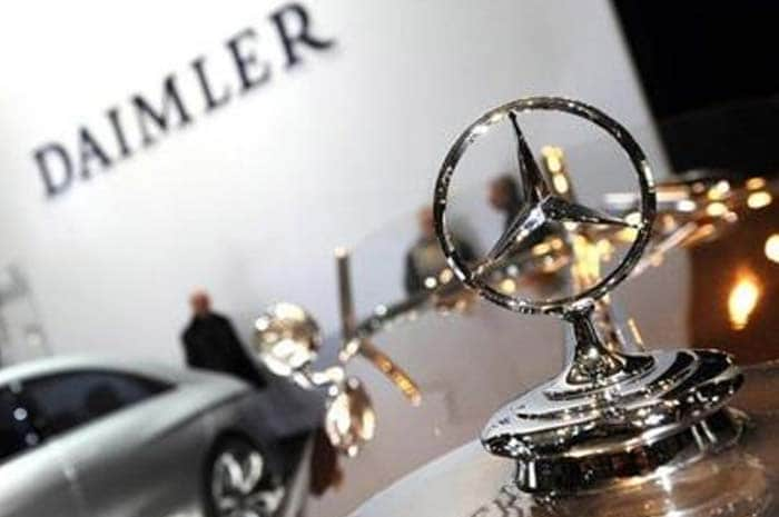
Mercedes-Benz
One look at the three-point star perched atop the grille or the bonnet and you know it's a Merc. But that wasn't always so.
Gottlieb Daimler, one of the founders of Daimler-Motoren-Gesellschaft (DMG) which originally owned the Mercedes brand, sent his wife a post card in the 1870s, marking his residence with a three-point star.
"One day, this star will shine over our triumphant factories," he wrote. Prophetic? This stuck with his sons—Paul and Adolf Daimler—who suggested the star logo to the DMG board after the brand's success in the 1900s.
While the company registered both the three- and four-point stars in June 1909, it has only used the three-point star as its logo, which has seen various makeovers in its lifetime, especially after the merger with Benz. -
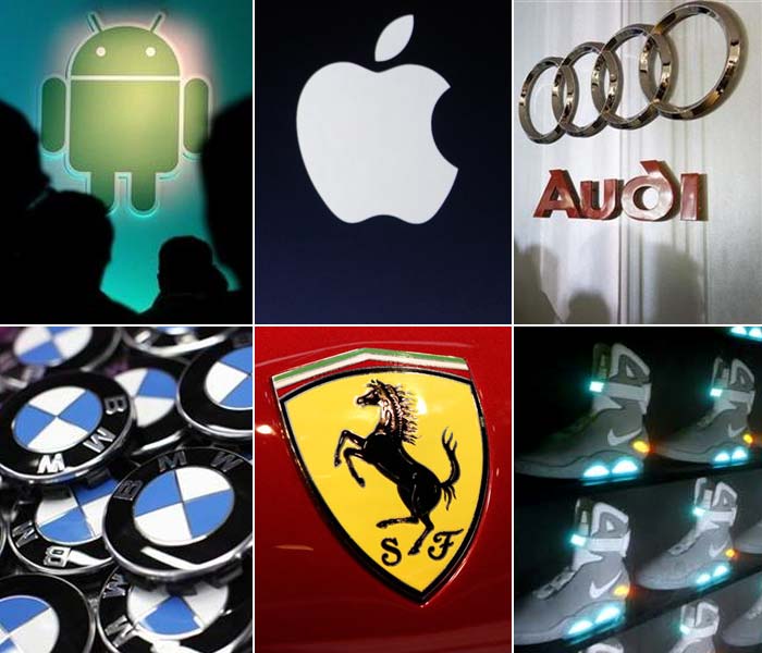
Apple
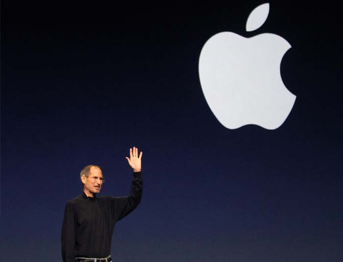
The famous tech company founded by Steve Jobs has a partially-eaten apple as its logo in monochrome. But not many know that its first logo, designed by Ron Wayne, depicted Sir Isaac Newton siting under an apple tree.
However, almost immediately, it was replaced by Rob Janoff's design—a partially-eaten apple, except in a rainbow-coloured silhouette. Later, when Janoff presented Jobs several different monochromatic themes for the ‘bitten' logo, the legendary founder of Apple instantly liked the logo since it seemed to “humanize” the company. The bite was designed to differentiate the logo from the fruit. The coloured theme was finally discontinued in 1998. -
Nike
Nike's logo, very effective in all its simplicity, is the most powerful weapon of the US sports apparel company. Nike is the Greek goddess of victory, and the company's logo is derived from her wing, ‘Swoosh'. According to Greek mythology, the Swoosh motivates and gives warriors immense power and strength. Also, the logo stands out in the simple inscription of Nike in dull orange. -
Nestle
The Nestlé logo was launched by Henri Nestlé in 1868 based on the meaning of his name in German, little nest, and of his family emblem.
In 1938, the traditional nest design was incorporated with the Nestlé name. In the later years, the worm in the mother bird's beak was removed and the fledglings became two instead of three to reportedly depict an average modern family of two children. -
Toyota
Toyota began as Toyoda, the founder's family name. In 1936, it held a contest for a new logo to represent speed, and received 27,000 entries, from which one was finally selected. This also led to a change in the company's name to ‘Toyota' since it sounded better in Japanese. The eight-stroke count in the new name is reportedly associated with wealth and good fortune. The original logo is no longer found on the vehicles it manufactures, but remains the corporate emblem used in Japan.
In 1989, to commemorate its 50th year, Toyota introduced the logo that it is using until today—the three ovals in the new logo that combine to form the letter T, which stands for Toyota.
The overlapping of the two perpendicular ovals inside the larger oval represents the symbiotic relationship between the customer and the company, while the larger oval represents the “global expansion of Toyota's technology and unlimited potential for the future”. -
Android
The Android robot is a prime example of a playful logo made of fairly simple shapes. The logo was designed by California-based graphic designer Irina Blok, while the Android word mark was created along with the Droid font family by the Chicago-based type foundry Ascender Corporation.
‘Android Green', the colour of the Android Robot that depicts the Android-operating system, stands for growth, freshness and prosperity. -
Ferrari
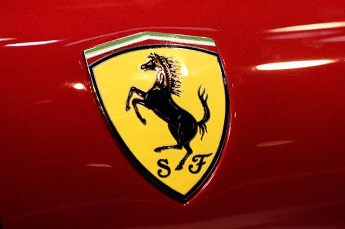
Ferrari's logo is inspired by the character of Count Francesco Baracca, the star of Italian Air Force during World War I. The designer of the logo painted the ‘prancing horse' on his plane. After Baracca's demise, the company—founded by Enzo Ferrari—decided to use the horse emblem. -
BMW
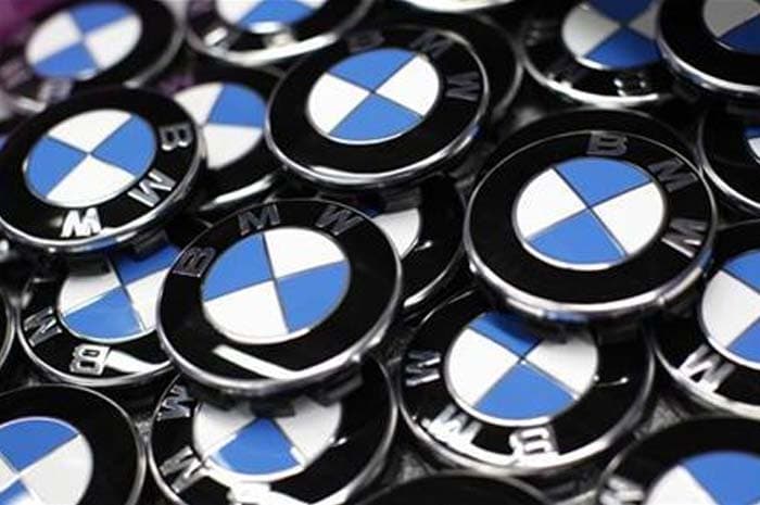
The circular blue and white logo, or roundel, evolved from the Rapp Motorenwerke logo, from which Bayerische Motoren Werke AG, or the BMW company, grew, combined with the blue and white colors of the flag of Bavaria.
The logo portrays a moving aircraft propeller with white blades cutting through a blue sky, first used in a BMW advertisement in 1929, 12 years after the roundel was created. -
Audi
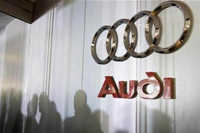
Audi, which means ‘to listen' in Latin, was formed after its founder August Horch was forced out of his former auto company—Horch—which in German means ‘hark' or ‘hear'. In 1932, Audi merged with Horch, DKW, and Wanderer, to form Auto Union, which used the four interlinked rings that make up the Audi badge today. While it was earlier used only on Auto Union racing cars in the World War II period, it later became the official emblem.

